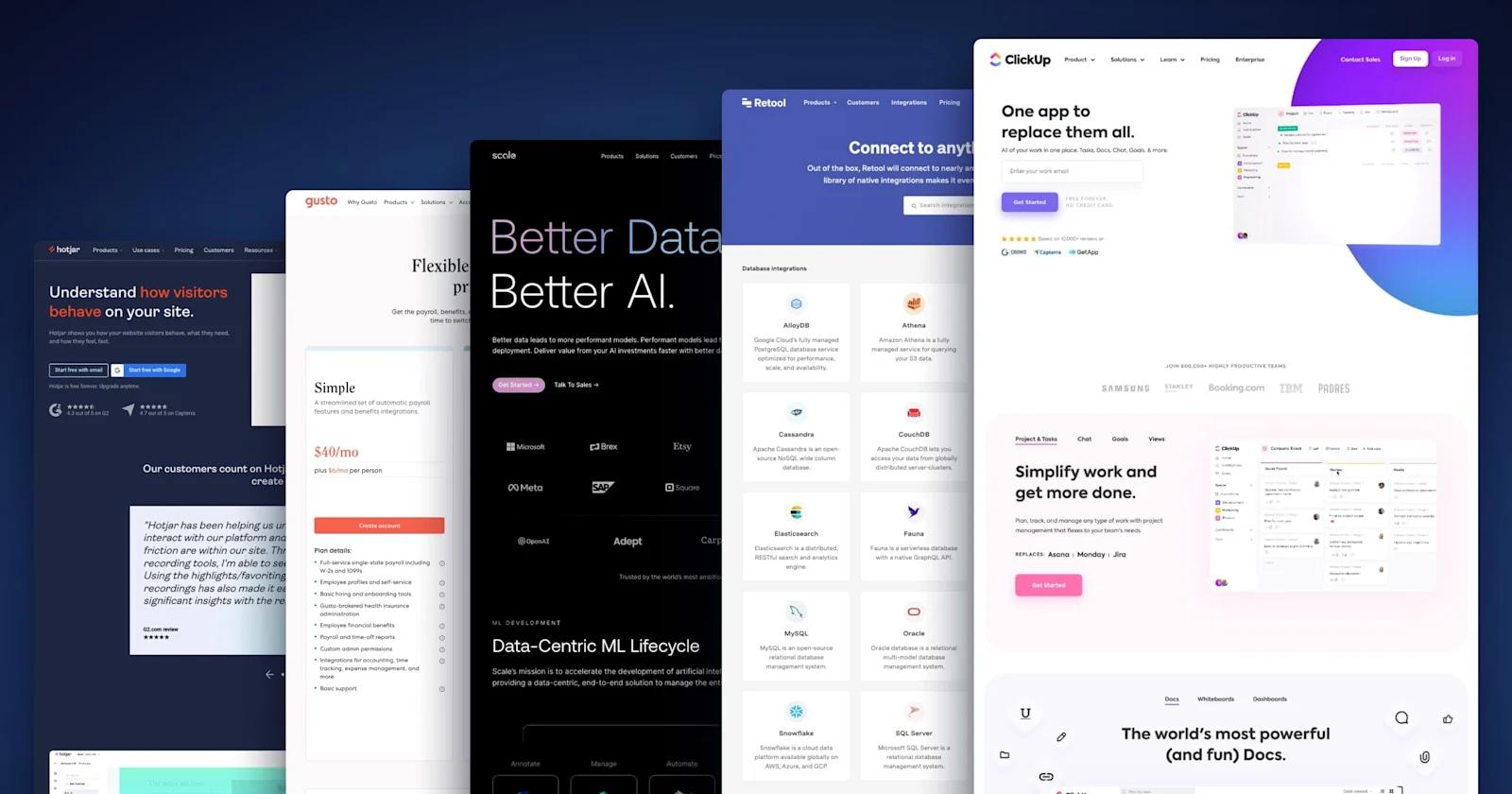
In the digital world, color is more than just a design element—it’s a powerful communication tool. A well-chosen website UI (User Interface) color palette can influence emotions, improve user experience, and most importantly, strengthen brand identity.
In this article, we’ll explore the fundamentals of color palettes in UI design, followed by 15 real-world examples of websites from leading brands and how they effectively use color to enhance their digital presence.
🔍 What is a Website UI Color Palette?
A UI color palette is the collection of colors used throughout a website or application interface. It typically includes:
Primary color: Main brand color used prominently.
Secondary color: Used to support the primary color.
Accent color: Used for buttons, links, or calls to action.
Neutral tones: Backgrounds, borders, and text (e.g., black, white, gray).
State colors: Indicate success, warning, or error (green, yellow, red).
An effective UI color palette ensures consistency, readability, and accessibility across all devices.
🧠 Why Color Matters in UI Design
Brand Recognition: 80% of users recognize a brand by its color.
Emotional Response: Colors evoke feelings—blue for trust, red for urgency, green for health.
User Engagement: Color contrast improves readability and guides users through CTAs (Call-to-Actions).
Accessibility: Proper use of contrast ensures visibility for users with visual impairments.
🌈 15 Brand Websites and Their UI Color Palettes (With Explanations)
1. Google
Palette: Blue, Red, Yellow, Green, White
Explanation: Google uses primary colors to represent diversity and simplicity. The color scheme reflects their playful, friendly brand identity.
2. Apple
Palette: Black, White, Silver, Space Gray
Explanation: Apple uses a minimalist monochrome palette to express elegance, modernity, and focus on the product.
3. Spotify
Palette: Green (#1DB954), Black, White
Explanation: Spotify’s vibrant green pops against black, symbolizing creativity and energy—perfect for a music streaming platform.
4. Facebook (Meta)
Palette: Blue (#1877F2), White, Gray
Explanation: Blue conveys trust and calmness. It’s also color-blind friendly, ensuring usability across a wide audience.
5. Netflix
Palette: Red (#E50914), Black, White
Explanation: The bold red creates urgency and excitement, ideal for a video streaming service focused on entertainment.
6. Amazon
Palette: Orange (#FF9900), Black, White, Blue
Explanation: Orange represents friendliness and affordability. It’s energetic and drives users to engage with the marketplace.
7. Coca-Cola
Palette: Red (#F40009), White
Explanation: Coca-Cola’s signature red is iconic, evoking excitement and youthfulness, while white balances the vibrancy.
8. Dropbox
Palette: Blue (#007EE5), White, Gray
Explanation: Blue implies reliability and security, crucial for a cloud storage platform. The clean look supports focus and productivity.
9. Slack
Palette: Aubergine (#4A154B), Green, Blue, Yellow, Pink
Explanation: Slack’s colorful palette reflects a collaborative and creative workspace. Aubergine adds uniqueness and warmth.
10. Airbnb
Palette: Rausch Pink (#FF5A5F), White, Gray
Explanation: Pink softens the platform, promoting comfort and friendliness—key emotions in hospitality.
11. LinkedIn
Palette: Blue (#0A66C2), White, Gray
Explanation: Like Facebook, LinkedIn uses blue for trust and professionalism—suitable for a career-focused platform.
12. Instagram
Palette: Gradient of Pink, Purple, Yellow, Orange
Explanation: The gradient design symbolizes creativity, fun, and energy—ideal for a platform filled with visual content.
13. Microsoft
Palette: Blue, Green, Yellow, Red, White
Explanation: The multi-color logo represents diversity in Microsoft’s product offerings. Clean UI with white space supports clarity.
14. Tesla
Palette: Black, Red (#E82127), White, Gray
Explanation: Tesla uses a sleek, high-contrast palette to reflect modernity and performance. Red symbolizes power and innovation.
15. Adobe
Palette: Red (#FF0000), Black, White
Explanation: Adobe’s strong red connects to creativity and bold expression, while black and white offer professional balance.
🎯 How to Choose the Right Color Palette for Your Website
Choosing a color palette depends on multiple factors:
1. Understand Your Brand Personality
Are you modern or traditional? Energetic or calm?
Match colors with your brand traits. E.g., Green for eco-friendly, Blue for tech, Red for excitement.
2. Know Your Audience
Younger audiences prefer bold, vibrant colors.
Professionals lean toward clean, muted tones.
3. Use the 60–30–10 Rule
60%: Primary color
30%: Secondary color
10%: Accent color
This ratio ensures balance and harmony across your UI.
4. Test for Accessibility
Use tools like:
Contrast Checker & ColorBlindly
Ensure your palette meets WCAG guidelines for accessibility.
🛠️ Tools to Help You Build a Color Palette
Coolors – Auto-generate beautiful palettes.
Adobe Color – Explore color wheel, harmonies, and trends.
Paletton – Preview how colors work in real UIs.
Material UI Colors – Predefined palettes for UI design.
✅ Final Thoughts
A strong UI color palette is more than aesthetics—it’s a strategic tool that enhances your brand message, increases usability, and improves conversion rates. As seen from the examples above, top-performing brands carefully choose their palettes to align with their vision and audience.
When designing your website, take time to explore colors that not only look good but also feel right. A well-crafted palette builds trust, drives action, and creates a memorable experience.


Recent Comments